How reducing cognitive load increased conversion by 22% and cut completion time in half.
Simplotel powers the booking engine for over 3,000 hotels across India. Every day, thousands of travelers interact with our booking form — and for many hotels, it's the single most important conversion point.
The existing booking form worked, technically. But user testing revealed something troubling: the "Room & Guest Details" step was hemorrhaging users. Over 30% dropped off at this single step. This wasn't a bug — it was a design failure.
6-week sprint · 3,000+ hotels affected · Cross-functional team of 6
The booking form is the bottom of the funnel — the moment where intent converts into revenue. Hotels were investing heavily in SEO and marketing to drive traffic, but losing a third of those high-intent users at the final hurdle.
I started with the data, but I knew numbers alone wouldn't tell the full story. I needed to watch real people struggle.
"Why does this take so long? I just want two rooms for my family. Every other app makes this easier."
— Mother booking for family"If I make one mistake mapping guests to rooms, I have to start all over. I've lost bookings because of this."
— Travel Agent (daily user)The data showed 30% drop-off at the Room & Guest step. My first instinct: the form has too many steps. So I wireframed a simpler 3-step linear flow — just collapsing the sequence. Clean. Logical. Testable.
Week 1 testing: completion time barely moved. Users were still confused. Still abandoning. The problem wasn't the number of steps. It was what was happening inside the hardest step — the cognitive overload of managing rooms, guest counts, child ages, and room assignment all at once, with no feedback on whether you were doing it right.
I collapsed 5 steps into 3. Users still dropped off. The surface-level fix (reducing steps) didn't address the actual problem: cognitive load within each step. The old form asked users to hold rooms, guest counts, ages, and assignments in their heads simultaneously, with no running total to check themselves against.
Once I stopped counting steps and started mapping what users had to hold in working memory at any given moment, the real solution surfaced. The breakthrough wasn't removing a step — it was giving users a live summary so they could stop tracking state in their heads. The sticky summary card was a direct response to watching testers lose count of their own booking.
After synthesizing research, I realized the problem wasn't just about speed — it was about cognitive load. The form was asking users to juggle too many things at once.
Too many visible choices at each step increased decision time. Users faced 12 decision points for a simple booking.
Users expected familiar patterns from Booking.com and MakeMyTrip. Our form forced them into an unfamiliar flow.
We were asking users to hold room counts, guest counts, child ages, and room assignments in working memory simultaneously.
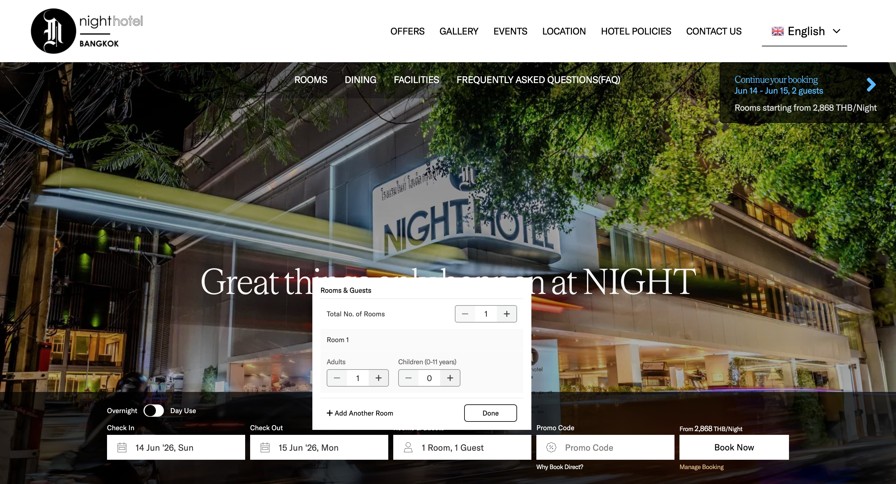
The biggest change: I merged rooms and guests into one interactive screen. Users add rooms, assign adults/children, and select age ranges — all without leaving the step.
The live summary updates in real-time: "1 Room · 2 Adults · 1 Child". Users always know exactly where they stand.
Design decision: I placed the "+ Add Room" button below the first room — not in a header or sidebar. In testing, users naturally scanned top-to-bottom and found it immediately.
The old form asked parents to type each child's exact age. This felt intrusive and confusing — why does a hotel need to know my child is exactly 7?
I replaced it with quick-tap age ranges: 0–2, 3–5, 6–10, 10+. Hotels need age brackets for pricing — not exact ages. What once took 35 seconds per child now takes under 3 seconds.
Design decision: We considered a slider but tap targets tested faster. Parents could one-tap and move on — no precision needed.
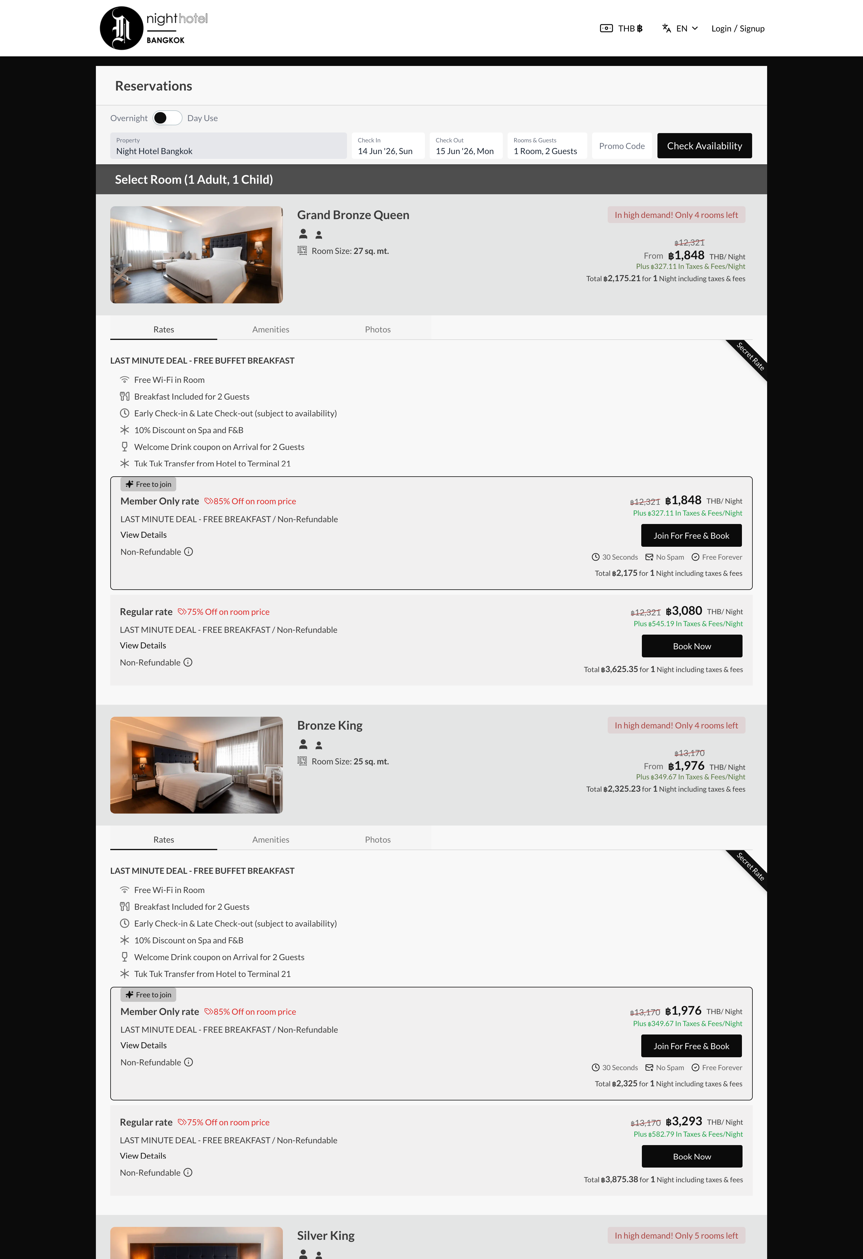
Essentials visible upfront (rooms, adults, children), nice-to-haves tucked into accordions (special requests, accessibility needs). Reduced visual clutter by 40% while keeping all options accessible.
Inline validation replaces the old 'submit and see errors' pattern. If a user selects 3 children but only assigns ages to 2, the form gently highlights the missing selection — no scary red error states.
A sticky summary card shows the current selection at all times: "2 Rooms | 4 Adults | 2 Kids". Users never have to go back to check. This single change reduced back-navigation by 60%.
For travel agents booking multiple rooms: guests are auto-distributed evenly across rooms. Agents can then manually adjust. Turned a 3-minute mapping task into a 15-second review.
Started with a simple merged form. Testing revealed users didn't notice the age range selectors — they looked like static labels. Also, the 'add room' button was missed by 40% of users.
Much better — completion time dropped to 1.8 minutes. But travel agents found the summary too small and wanted keyboard shortcuts. Parents wanted to see what each age range meant for pricing.
Completion time at 1.3 minutes. Zero complaints about the age input. Travel agents called it 'exactly what we needed.' The sticky summary tested perfectly — users felt confident throughout.
"I can finally book 3 rooms without worrying about messing it up. The auto-assignment saves me so much time."
— Travel Agent"This feels so much faster. I don't have to fight with the form anymore — it just works."
— Parent booking for familyChanging child age input from exact number to range selector was a tiny design decision that reduced friction by 90%. Audit every single interaction — the smallest ones often have the biggest impact.
Travel agents needed power features (keyboard nav, auto-assignment). But the form also had to work for a parent booking their first family trip. Progressive disclosure let me serve both.
The sticky summary card was the most praised feature in testing. Users said it made them feel 'in control.' When users can't see what they've done, they feel lost.
Jakob's Law proved itself. When our form started looking like what users expected from Booking.com, completion rates jumped. Innovation in UX should be invisible.
The booking form stopped feeling like a chore. It became what it was always meant to be — the starting point of a journey.
Special thanks to Tarun (CEO), Shuvam Das (Product Manager), Engineering team, and all the fellow Designers