Designing for Speed, Clarity & Confidence across 3,000+ hotels.
When I joined Simplotel, one of the most intriguing yet underperforming pieces of the booking experience caught my eye — the itinerary flow. This is the journey a guest takes from selecting a hotel to confirming their stay.
On paper, it worked. But when I observed users — hotel guests, travel agents, and corporate bookers — it didn't feel smooth. People would pause mid-way, unsure if their data was saved. Some dropped off and came back later, only to start over.
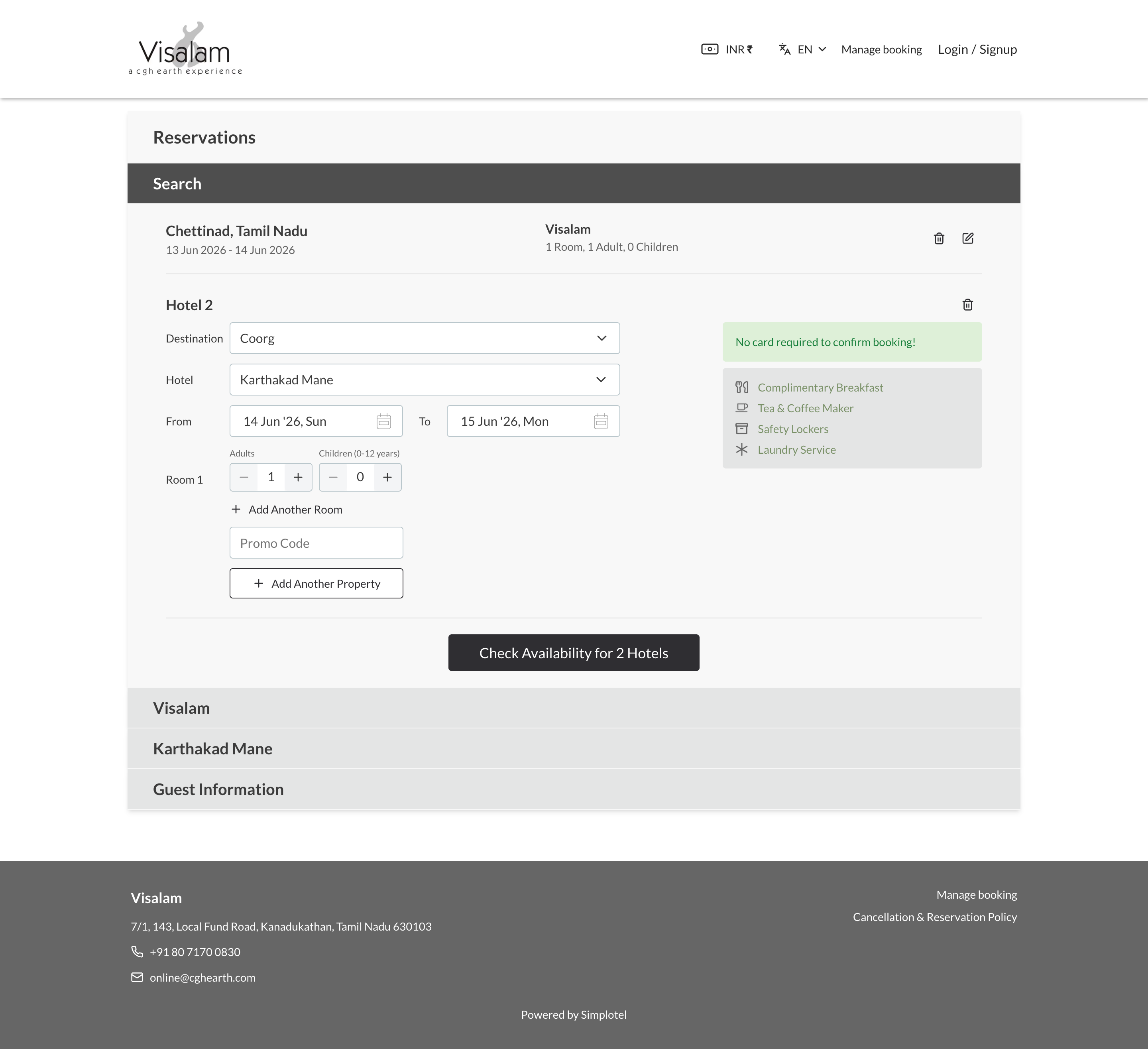
The redesign is now live across 3,000+ hotels, including CGH Earth — a group of award-winning eco-luxury properties across India — where guests can book multi-destination itineraries (Chettinad → Coorg, for example) in a single unified flow.
Ongoing project · 3,000+ hotels · Cross-functional team
The itinerary flow was losing users at critical moments. Our analytics and support logs told a consistent story:
"I wasn't sure if my booking was saved. The page just froze. I ended up starting over on my phone."
— User feedback, session recording"If I could book 2–3 properties in one go, it'd save me so much time."
— Travel Agent"Guests keep asking for the final total — the 'per night' pricing confuses them."
— Front Desk Staff"Error messages come too late. I only realize something's wrong after I hit submit."
— User feedbackEvery hotel booking platform in 2022 did the same thing: book one property at a time. If a guest wanted to stay at two CGH Earth properties back-to-back — Spice Village in Thekkady, then Kumarakom Lake Resort — they made two separate transactions in two separate flows, with no connection between them.
CGH Earth wanted to change that. The ask: let guests book a multi-destination itinerary as one journey. No one had built this before, not in this format. There was no reference design to follow.
In early testing, guests kept setting overlapping dates. They'd pick Check-out from Property A on the 15th, then set Check-in at Property B on the 12th. Some selected identical dates for both properties, expecting to be at two places at once.
This wasn't user error. The design had no visual signal that dates across properties needed to flow sequentially. The form accepted impossible inputs without a single warning.
My first design showed two independent date pickers — one per property. Clean, symmetrical, and completely wrong. There was nothing telling users that Property B's check-in had to follow Property A's check-out. Testers kept setting impossible bookings, got a generic error at the end, and had no idea why it failed.
Property B's check-in auto-populated from Property A's check-out date, with a clear "Continue your journey →" connector between them. If a guest manually overrode it with an earlier date, a conflict state triggered immediately — highlighted in amber, with a plain-English message and the correct date pre-suggested. The constraint became visible before it could be broken.
Every interaction must communicate purpose. No visual ambiguity. Users should never wonder "what does this do?"
Steps should feel connected — part of one narrative. The booking should flow like a conversation, not a form.
The design should constantly reassure users. Show totals, progress, and what's included — always.
I restructured the flow around a contextual progression: Place → Hotel → Dates → Rooms. Each step naturally feeds into the next, creating a narrative rather than a form.
Travel agents told us repeatedly: "If I could book 2–3 properties in one go, it'd save me so much time." We added a subtle nudge — "Are you travelling to multiple locations?" — with an "Add Another Property" option.
Using Hick's Law, we avoided overwhelming single-property users. The multi-property option is visible but unobtrusive — a dashed border button that only expands when tapped.
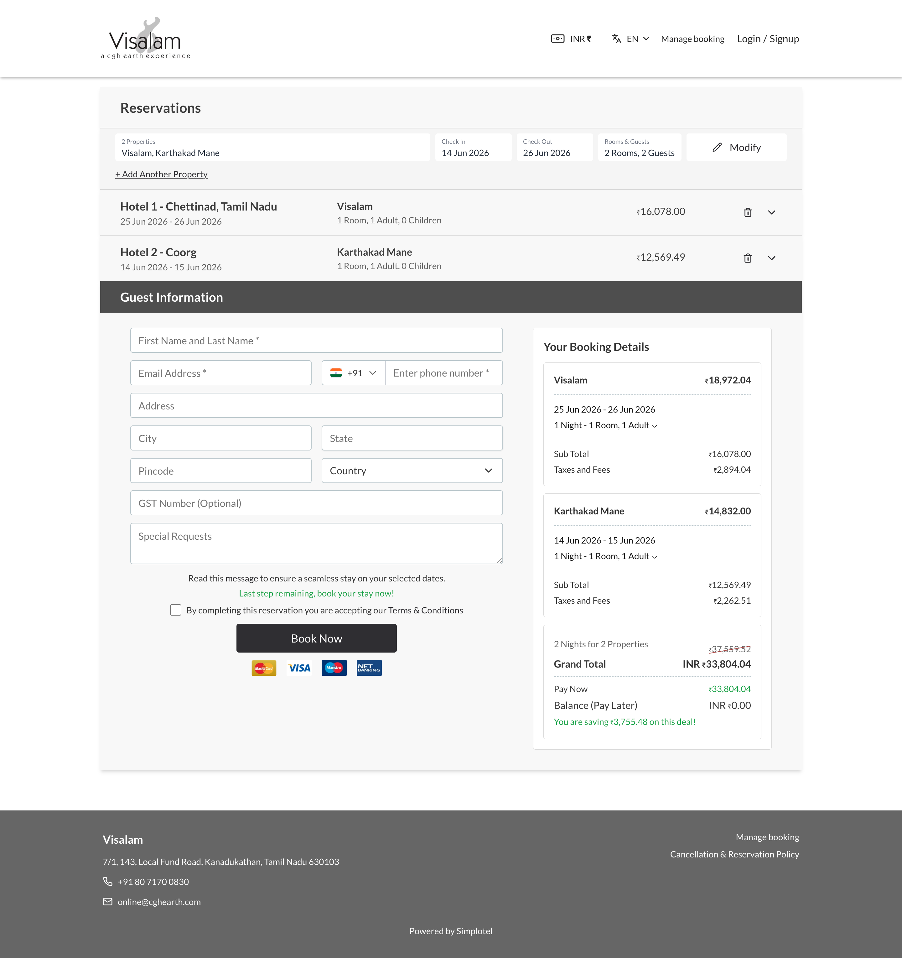
Design decision: Each property card shows dates, room count, and inclusions inline. Users can see their entire trip at a glance without expanding anything.
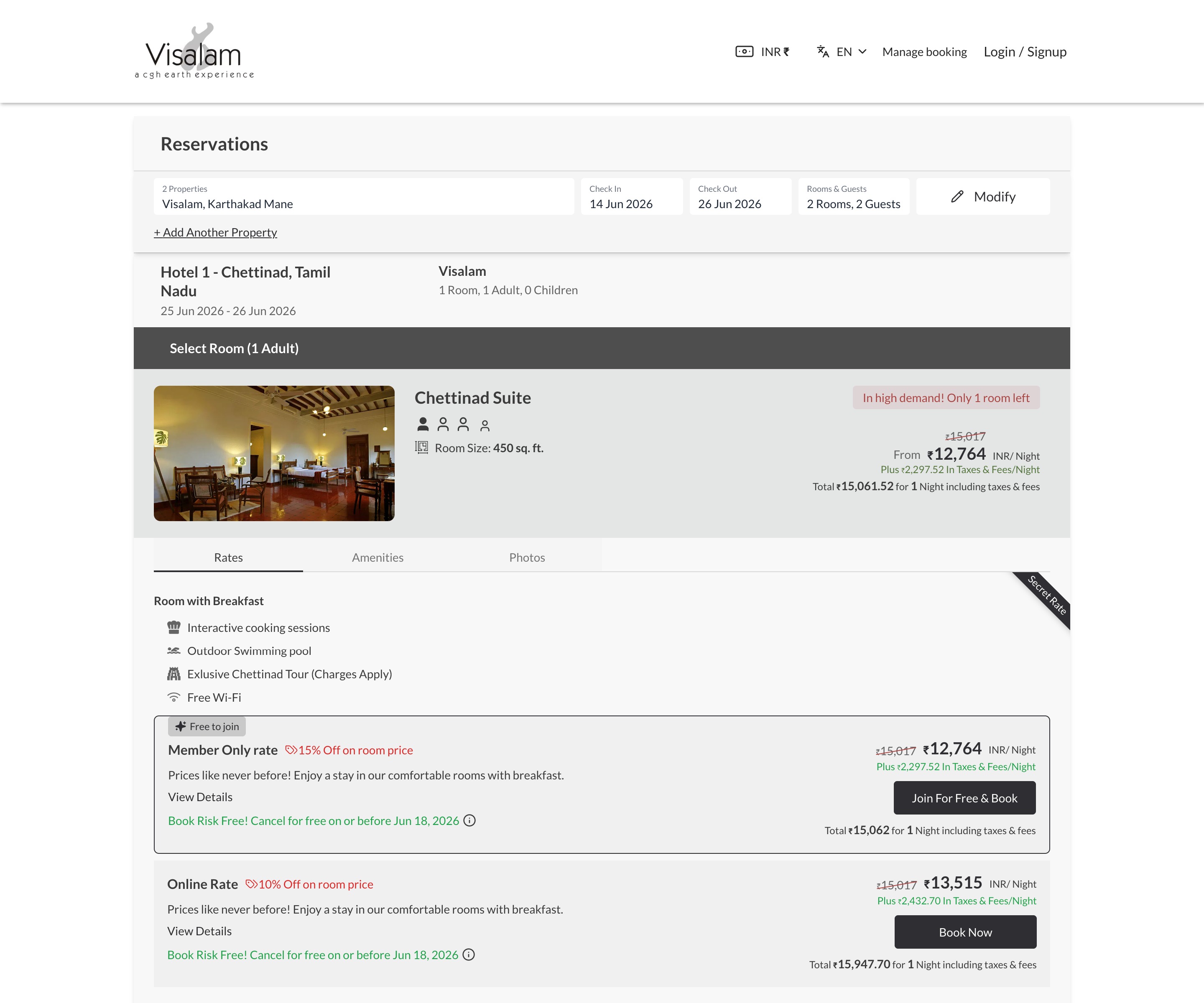
We changed from ₹10,769 / Night to Total ₹12,708 — Includes Taxes & Fees. This single change reduced cognitive load dramatically.
I added a collapsible fee breakdown — taxes, service charges, discounts. Users who wanted details could see them; others got the confidence of knowing everything was included.
Design decision: A cleaner pricing display makes users perceive the price as more fair, even when the total is identical.
Fields appear contextually, guiding users step by step. Each completed step collapses with a summary, keeping the interface clean and momentum alive.
Switched to inline, real-time validation. If dates conflict, the calendar highlights the issue immediately. This one change reduced input-related drop-offs by 40%.
Brought inclusions (breakfast, WiFi, airport pickup) right into the itinerary view — clearly visible, visually grouped with icons. Users reported feeling more value even when the offering hadn't changed.
Redefined spacing with a 12-column grid and consistent 8px spacing. Typography hierarchy guides the eye: property name → dates → price → inclusions.
Started with a linear flow that showed all fields at once. Testing revealed users felt overwhelmed. The multi-property feature confused single-property users.
Much better flow, but pricing still caused confusion. Users paused at the total, mentally calculating if taxes were included. The inclusions were in a separate tab nobody clicked.
Travel agents loved the multi-property flow but wanted to see all properties summarized before confirming. The progress indicator was too subtle.
"I can now book a multi-city trip in one session. My clients love seeing the full itinerary before confirming."
— Travel Agent"It finally feels like one trip, not three separate forms. The total pricing with inclusions gives me confidence."
— User feedbackShowing total pricing with tax breakdown didn't just reduce confusion — it increased perceived fairness. Users who see a clear price feel less anxious about hidden costs, even if the total is higher.
Showing everything at once overwhelms. Showing the right thing at the right time guides. The contextual flow pattern — where each completed step collapses — kept users focused.
The old flow treated booking as a data-entry task. The new flow treats it as a trip-planning experience. This mindset shift changed everything about how we designed each step.
The multi-property feature was designed for power users, but the clean interface benefited everyone. Simplicity isn't about removing features — it's about revealing them at the right moment.
Great design isn't about adding features — it's about removing friction. Design that makes the invisible, intuitive.