As sole designer and co-founder, I took PulseBills from a hunch about an underserved market to a live product — reducing clinic billing time by 85% and getting GST compliance down to zero effort.
India has over 500,000 small clinics — physiotherapy centers, dental practices, solo physicians, ayurveda clinics, diagnostic labs. These are not hospitals. They are often one doctor, one receptionist, and a waiting room with 30 patients.
Almost all of them manage billing the same way they did twenty years ago: a paper register, a calculator, and at best, a WhatsApp message with the final amount. Not because they're resistant to technology. Because nothing was built for them.
Hospital software — what the industry calls HIS, Hospital Information Systems — costs lakhs in licensing, requires weeks of training, and was architected for a 200-bed multi-specialty hospital. It treats a three-room clinic like a scaled-down hospital. It's wrong for the problem at every level.
The market gap wasn't awareness. It was fit. No one had built something genuinely simple enough for a clinic that sees 50 patients a day, needs GST-compliant invoices, and wants to be up and running before lunch.
The worst thing a designer-founder can do is trust their instincts over their users. I had a hypothesis. I needed it tested before a single pixel was placed. So I spent weeks doing nothing but watching and listening.
"We tried a software once. It took three days to set up. Staff couldn't figure it out. We went back to paper that week."
— Physiotherapy clinic owner, Bangalore"I just need to make a bill and send it. Why does every app want me to learn something first?"
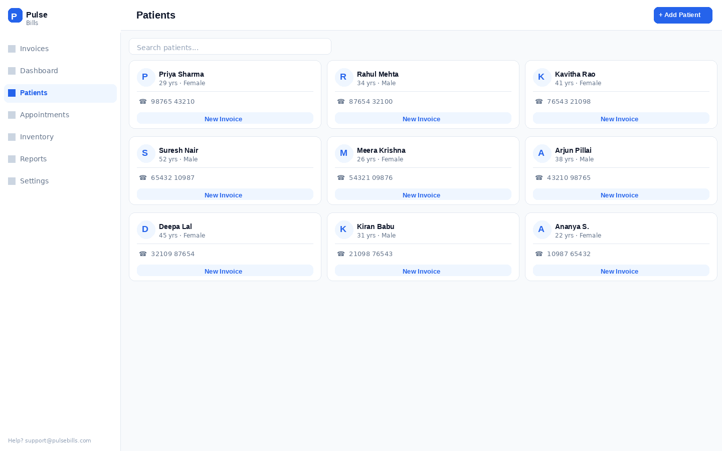
— Receptionist, multi-specialty clinic, ChennaiEvery clinic I visited had a different workflow, different specialty, different patient volume. But they all shared one truth: the receptionist is the product's real user — not the clinic owner who buys the subscription. Existing tools were designed to be sold to owners but used by staff who never chose them. The mismatch was the entire problem. I designed PulseBills for the person actually holding the phone.
30–80 patients a day. No tolerance for learning curves. Will go back to paper the moment something is confusing. The product lives or dies by whether she uses it naturally.
Runs the practice alone. Does billing between appointments. On his phone. Has 90 seconds maximum to create an invoice before the next patient walks in. Will not come back if it takes longer.
May not touch the product daily but approves the subscription. Needs confidence it's running correctly, wants a revenue snapshot, and above all — needs staff to actually adopt it.
When you're a solo designer-founder, you need principles that hold every decision in place — especially at 11pm when you're second-guessing a layout. These four ruled everything.
Every feature request was filtered through one question: does this make the core flow faster? Features that added time — even useful ones — went to a backlog. The product should do fewer things at a speed that earns daily use. A receptionist billing a patient doesn't need 12 fields. She needs 4.
There's a difference between a desktop product that shrinks for mobile and a product born on mobile. I designed every screen at 375px first. If something worked on desktop but broke on mobile, it got redesigned — not adapted. India is a mobile-first country. This wasn't a choice; it was a constraint that made the product better.
GST compliance is a real anxiety for Indian small business owners. My answer was to remove it from their line of sight entirely. Tax rates, invoice numbering, GSTIN formatting, HSN codes — all automated. The user enters a service and a price. The law is satisfied without them knowing how. Compliance without cognitive load.
The billing interface deliberately looks like a shop receipt. The dashboard looks like a bank statement. These aren't design failures — they're trust mechanisms. When an interface matches a mental model a user already has, they feel in control immediately. Novelty earns admiration. Familiarity earns adoption.
My first billing flow was a 4-step wizard: select patient → add services → apply GST → confirm. Modeled on every billing tool I'd studied. Logical. Clean. Sequenced. I spent three weeks on it.
I put it in front of receptionists at two clinics. The feedback was quiet but clear: they completed the test, but they wouldn't use this every day. One receptionist said it out loud — "I'd have to stop three times just to bill one patient."
A busy clinic bills 40–60 patients a day. Every tap, every screen transition, every "Next" button is friction multiplied by 60. The wizard felt reasonable in a quiet testing room. In a real clinic with a patient standing at the counter, it felt impossibly slow. I had designed for a scenario — not for a reality.
The breakthrough was watching a receptionist work with paper. She never "stepped through" anything — she had a single form in front of her, filled it simultaneously, and moved on. The wizard was imposing a mental model that didn't exist in their work. Once I collapsed the entire billing flow onto one screen, task time dropped from 3–5 minutes to under a minute. Dense isn't bad when the density is readable.
Standard billing software uses a multi-step wizard: select patient → add services → apply GST → review → confirm. It's logical on paper and catastrophic in a busy clinic. Every step is a chance to get interrupted, lose context, and abandon the flow. Three taps to reach a "Next" button is three taps too many when a patient is waiting.
I collapsed the entire billing flow onto one screen. Patient search at the top. Service selection in the middle. Live total, auto-GST, and WhatsApp share at the bottom. The entire invoice is visible and editable without scrolling. There is no Next button because there is no next step.
Early testers called it "too dense." In usability sessions, those same testers completed billing 2× faster than with the wizard prototype. Dense is fine when it's scannable. Clarity beats whitespace when time is the currency.
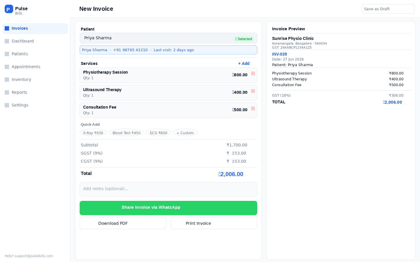
Every clinic offers the same 5–15 services, repeated 40 times a day. Asking staff to type "Physiotherapy Session — ₹800 + 18% GST" every time isn't a UX inconvenience — it's a design failure. It's treating a billing tool like a text editor.
Service templates let clinic owners pre-configure their entire treatment menu once. After setup, billing is tap a patient, tap a service, tap share. Three gestures. Templates also eliminate the single biggest source of billing disputes: incorrect prices. When the price is locked in a template, it can't be mistyped under pressure.
In research, clinic owners were more excited about templates than any other feature in the product. The most common reaction was simply: "finally." When users say "finally," it means a frustration existed long before your product did. That's where the real value lives.
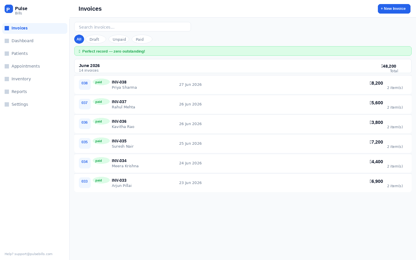
Most billing software sends invoices by email. Indian clinics don't communicate with patients by email. They use WhatsApp. Every time. The patient expects a WhatsApp message — not an email that goes unread in a promotional folder.
I built the share flow to open WhatsApp directly with the patient's number pre-filled and the invoice image attached. Two taps. The receptionist doesn't need to copy a phone number, open WhatsApp, find the contact, and paste. It just works the way she already works.
PDF generation and email are also available — for clinics that need them for their records or for corporate billing. But WhatsApp is the primary tap, primary placement, primary expectation. Products that serve a market adopt the market's norms, not their own.
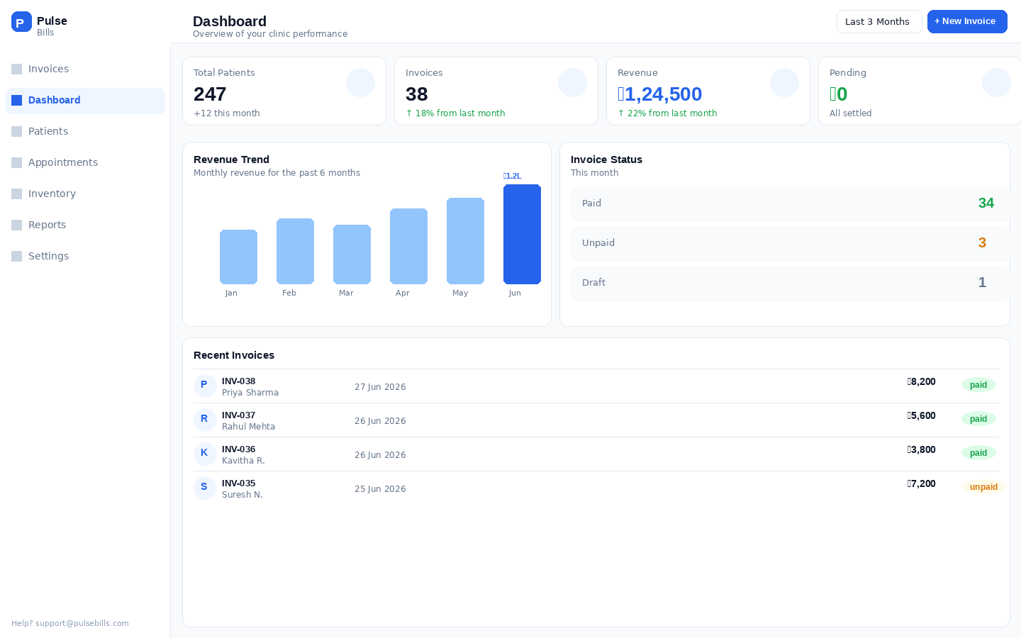
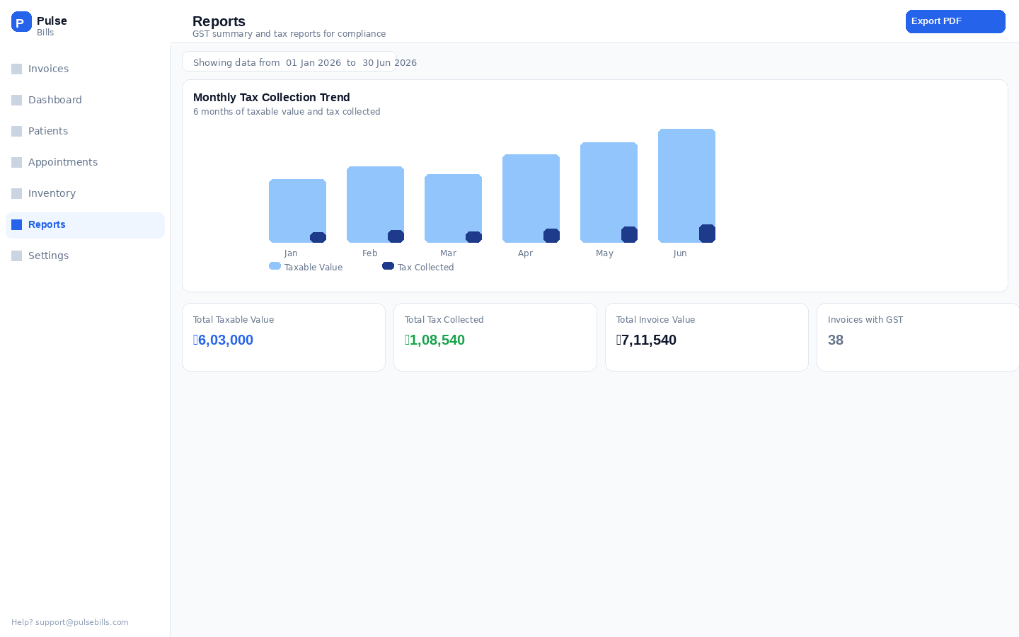
Clinic owners don't want a Tableau dashboard. They want to answer three questions when they open the app: how much did we make today, who hasn't paid yet, and is everything running? That's a number, a list, and a color. Not a chart library.
The first version of the dashboard had no graphs, no monthly trends, no cohort analysis. Clinic owners called it "reassuring" — not "limited." That distinction matters. When users call a product reassuring, they trust it. I was aiming for trust, not awe.
I later added a monthly trend view after persistent request from three power users. Session data three months later showed: the daily summary was opened 1,400 times. The trend chart: twice. The daily number is the product. Everything else is furniture.
Building a product you also sell teaches you something designing for clients never does: real users will tell you exactly what's wrong the moment they leave — with their feet. Every abandoned session, every "we went back to paper" conversation, was a design brief.
A three-step wizard — patient selection, service entry, review and share. Clean. Logical. Designed like a fintech onboarding. Tested with 5 receptionists across 2 clinics. Completion time: 2.5 minutes average. Three out of five users were interrupted mid-flow by another patient, lost context, and restarted. One said "I'll just use paper, it's faster."
Time dropped to 65 seconds. Significant improvement, but still slow. Root cause: service selection required typing names. Templates existed but displayed as a scrollable list — two receptionists on mobile missed the add button entirely. GST showed three lines (base, SGST, CGST) — one clinic owner called it "confusing like a bill from a lawyer."
Billing time: 30–42 seconds. WhatsApp share feels native to how the clinic already works. Patient lookup returns results in under 2 seconds. Clinics that adopted it haven't returned to paper. One receptionist showed the product to clinic owners in her building — unsolicited. Organic advocacy from a user who had no stake in the product's success is the only metric I fully trust.
"Our billing used to take 10 minutes when it was busy. Now one patient walks out while the next one walks in. The staff actually likes it — that never happened with software before."
— Clinic owner, physiotherapy center"I showed my CA the invoices from PulseBills and he said they're perfect for GST filing. I didn't have to do anything extra. That was the moment I knew this was different."
— Solo practitioner, dental clinicBeing the designer and the founder of the same product is a relentlessly honest education. There's no client to blame for a bad brief. There's no handoff to hide behind. The product is exactly as good as your decisions — and the market has no politeness.
Every clinic asked me for "more reports." What they actually needed was to spend fewer minutes on billing so they could see more patients. The design manager in me heard the feature request. The founder in me looked at what they actually did with their extra time. Always follow the behavior, never just the words.
A user who will simply return to paper when confused has no obligation to give you feedback. They just leave. Designing for a receptionist who hasn't chosen your product means removing every assumption from the interface. No tooltips, no onboarding modals, no "quick tips." The design itself has to be the onboarding.
V1 was rough. The three-step wizard was logically sound and contextually wrong. I would have polished it for another month if I hadn't forced myself to put it in front of real clinics. The embarrassment of shipping imperfect work accelerated learning by weeks. Every day of polish before launch is a day without real feedback.
As a hired designer, "the best design" is the question. As a solo designer-founder, the question is "the best design I can ship this week that moves the right metric." The scope constraint isn't a limitation — it's a clarity machine. Constraint forces hierarchy. Hierarchy forces craft. The best design work I've done has come from the tightest constraints.
PulseBills is not a portfolio project that happens to be live.
It is a live bet — that beautiful, simple software
can change how half a million Indian clinics run.
I'm still building it. Every clinic that switches from paper is a validation. Every one that churns is a brief.